14 Best Canva Japanese Fonts
Are you wondering what font to use for your Japanese project?
Whether you’re working on your new brand logo, social media poster, or business card, there are varieties of this font to complement your design and your overall theme, mood, or tone of the content.
From traditional, modern, decorative to minimalistic, you have a lot to play with. Additionally, Japanese fonts are highly readable. So, you can use it for your headlines and small body text.
They are also a good choice if you want to reflect the cultural heritage and artistic traditions of Japan.
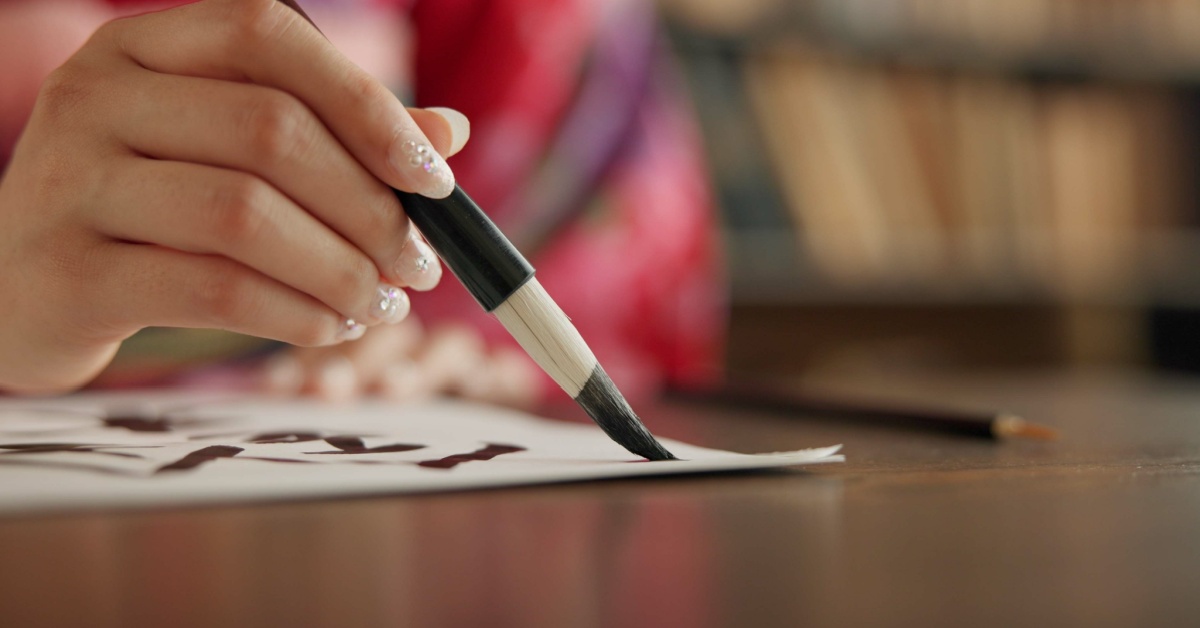
In this article, I have taken my time to review different Japanese fonts on Canva. Some of them include Kosugi Maru, Yuji Boku, Zen Kurenaido, Nagayama Kai, and Nato Sans JP.
I made sure to focus on the ones available on Canva’s free plan so you don’t need to spend a dime to access them.
Make sure to read to the end to find out which font works best for your designs.
Without much ado, let’s dive right in!
Also Read: Best Newspaper Fonts On Canva
Best Canva Japanese Fonts
1. Yusei Magic

This font is best suited for designs aimed at children or projects where you want a touch of creativity and playfulness.
You can’t look past its decorative elements like the swirls and curls. They’re highly imaginative and magical.
Additionally, the characters look like they were handwritten and this makes them more charming, adding a personal touch to your designs.
Seeing that the font is made with a lot of creativity and unique details, it makes sense that it takes inspiration from Gothic and sans-serif styles.
It also comes in different characters including kanji, hiragana, and katakana, making it adaptable across different types of Japanese text.
You can use it when designing works like posters, wedding invitations, greeting cards, or other kinds of decorative cards. It will bring personality and character to your projects.
Also Read: Best Japanese Fonts On Canva
2. Zen Kurenaido

Zen Kurenaido is another Japanese font available on Canva that appears handwritten. However, it doesn’t go over the top, rather it keeps it simple and minimalistic.
Unlike other sans-serif-inspired fonts, this font lacks brush-like elements and focuses solely on the essential structure of the characters.
This is why the font looks like ballpoint handwriting and also adds a personal touch to your designs.
Zen Kurenaido is inspired by the sans-serif style but with rounded edges. It is known for its friendly and inviting vibe. You can use it for different projects like branded materials, apps, websites, logos, and all kinds of digital designs.
3. Yuji Boku

Crafted by a popular designer called Yuji Kataoka, Yuji Boku is a handwritten font best used for children’s designs. This is because it captures the carefree, naive, and joyful nature of kids.
At a closer look, you’ll see thick and thin strokes, with a mix of curved and straight letterforms that make it look artistic. Although this font only has one style, it comes with different basic building blocks and includes extensive kanji characters.
This way, it’s more versatile and useful for a wide variety of design projects. You should use this font if you’re working on Japanese-themed designs, logos, editorial designs, or branding materials.
It will make your work look authentic and elegant.
Also Read: Best Luxury Fonts On Canva
4. Source Hans Sans JP Extra

Source Hans Sans JP Extra font was designed by Adobe as part of the general group of fonts called the Source Han Sans. These fonts are made for special languages like Chinese, Japanese, and Korean.
The “JP” in the font name means Japanese while the “Extra” attached means that it carries more features than the basic Source Han Sans font family.
This font stands out because of its simple and clean appearance. Your designs will be highly legible because the letterforms are clear and easy to read. There are no extra lines or curls at the end of the letters.
Also, it doesn’t matter whether you’re using it on paper or screen, it will work well. You’ll also notice that each character is well-spaced such that it’s comfortable to read both long and short walls of text.
In addition to that, the proportions of the characters are well-balanced. They are not too narrow or too wide plus the height is consistent, giving them a uniform appearance.
Lastly, while the font is designed to be simple, it also embodies the necessary details for Japanese characters such as hiragana, katakana, kanji, and even the punctuation marks.
This font will work well on simple designs addressing themes like technology, education, travel and tourism, and environmental awareness.
Also Read: Best Feminine Fonts On Canva
5. Sawarabi Mincho

If you want a font that adequately represents Japanese culture, Sawarabi Mincho is a good choice. It was created by a designer named Mshio to suit the Mincho style, part of the traditional serif kind of Japanese typography.
One of the top features of these fonts is the simple decorative strokes and serifs. They look like traditional handwritten characters, adding an air of fluidity to their appearance.
Interestingly, even with its traditional look, the Sawarabi Mincho font is still highly readable. You can use it both in print and digital media and your audience won’t have a hard time understanding your text.
Aside from that, the font’s elegance means that it works best for both text and headlines. Your designs will be neat since the characters appear well-arranged and are a bit close together.
Also Read: Best Arabic Fonts On Canva
6. Nagayama Kai

Nagayama Kai exudes an artistic flair. At first look, you’ll notice that the characters look like they were drawn by hand with a brush. This characteristic makes it stand out and visually appealing.
It’s also evident that the font was highly inspired by traditional Japanese calligraphy. The fluid and expressive brush strokes make it best fitted for designs that explore playful or artistic themes, like art, culture, travel, and lifestyle.
Another feature that stands out with this font is the expressive strokes which come in different thicknesses and intensities adding depth and character to the letters.
Even with its calligraphic style, the Nagayama Kai font goes the extra mile to make sure that the characters are legible. However, it’s best you use it for display purposes, like headlines, rather than the body of text.
Also Read: Best Christmas Fonts For Canva
7. Kosugi Maru

Inspired by the sans-serif font style, the Kosugi Maru font is well known for its simple letterforms. There are no decorative strokes at the end of the letters. This gives it a clean and minimalist appearance.
Interestingly, the letterforms have consistent width, adding to its clean and streamlined look. Even with its simple appearance, the font also features rounded edges which makes it look friendly and approachable.
You won’t encounter legibility issues when you use it in your designs. The characters are so easy to read no matter how small they appear.
The font’s simplicity also means that it can adapt to any design theme or format without overpowering other visual elements. It’s an excellent choice when working on educational posters or related to tech and business.
Also Read: How To Identify A Font From Images In Canva?
8. Noto Sans JP

Noto Sans JP is part of the “Noto” font family developed by Google. The aim was to have a unified font style that supports all languages and spreads a harmonious look and feel across different platforms.
Noto Sans JP supports the Japanese language and that’s why there’s a “JP” at the end. One of the major characteristics of the font is that it embodies a contemporary look.
The absence of fancy strokes at the end of the characters makes it appear sleek and elegant. You’ll also notice that the letters remain consistent in their thickness, making it look balanced and tidy.
Most importantly, the font is designed to be clear and legible, even when it’s small. Also, the fact that it lacks fancy designs means it fits well with a wide variety of designs including posters, logos, and branded materials.
The font embodies Japanese characters like kanni, katakana, hiragana, and punctuation marks.
Also Read: Best Y2K Fonts In Canva
9. Kaisei Tokumin

The Kaisei Tokumin font is best used for modern and sleek designs thanks to its straight and clean lines.
Being a sans-serif-inspired font, there are no decorative elements like you would get in letterforms typical in serif fonts. It also helps that the characters’ stroke width is consistent, giving it a balanced and uniform look.
Aside from that, the font is popular for its clear and well-defined letterforms. This clarity allows you to distinguish between one character and the other even at small sizes.
Interestingly, Kaisei Tokumin is widely created for on-screen readability. This means that no matter your screen size, it can fit into the size and resolution.
Also Read: Best Barbie Fonts In Canva
10. Kiwi Maru

According to Google, Kiwi Maru was created mainly to be used in digital screens like mobile apps, websites, and even electronic documents. This is because it has a sleek and simple appearance.
There are no fancy lines at the end of the letterforms. Rather, they are known by clean lines and simple shapes. These features make it easy to read especially when displayed on digital screens.
In addition to that, the Kiwi Maru font comes with unified widths and proportions across characters, making it appear cohesive and visually balanced. You can use it for any kind of design, weather headlines, or body text.
The best part is that the font will remain legible even at smaller sizes and lower resolutions.
Explore: Fonts Like Bluey On Canva
11. Hachi Maru Pop

Hachi Maru Pop is a special Japanese font that tries to bring back some of the cute and unique cultures from Japan in the early 1970s and 1980s.
The font looks round and playful and according to the creator, Norio Kanisawa, a lot of young Japanese girls in that era loved writing in circle-shaped letters. It was a trend back then although a lot of schools prohibited it.
However, a contest that required participants to make circular letters came up and Hachi Maru Pop was one of the winning designs. Since then, it has become the most common font for projects aimed at capturing people’s attention and spreading playful vibes.
The font looks like it’s handwritten with rounded edges and thick lines. It feels fun and whimsical, and you can use it for designs meant for younger people or children.
Due to the nature of the font, it’s best suitable for big titles and logos. You should pair it with other sans-serif fonts for your body text.
Additionally, you can use the font for writing in Japanese and even in other languages like English. It’s a special font that will give your design personality, so it easily stands out.
Explore: Best Canva Fonts For T-shirts
12. Hina Mincho

Hina Mincho is one of the oldest Japanese fonts. It is designed to look elegant and traditional especially when used on computers.
Just like traditional Japanese writing, the letters of this font are drawn with thin lines and small fancy strokes at the end, giving it a timeless and refined look.
This characteristic also adds to its elegance and gracefulness. It’s the perfect font for formal projects or any design that needs a traditional feel.
The font looks nice on screen and in print, plus it’s easy to read. You should use it mostly in your body text as the letters are simple, clear, and well-defined, so readers can understand them easily.
Also Read: Best Collegiate Fonts On Canva
13. AR Mincho

The AR Mincho font is inspired by the Chinese typography style from the early 1960s called Mingti. This style is known to be highly traditional and elegant with smooth lines and fancy bits at the ends of the letters.
The font also features large spaces inside letters, gentle lines, and simple shapes. This simplicity makes it best suited for designing formal and classic projects.
Furthermore, the font is highly legible and enjoyable to read, especially when you have a lot of text like when reading a book, newspaper, or magazine.
Overall, AR Mincho can be used in different kinds of Japanese writing including kanji, hiragana, katakana, and punctuation marks.
Also Read: 70s Fonts On Canva
14. Dela Gothic One

Created by Japanese designer Artakana, Dela Gothic One is a bold and versatile font that supports lots of characters and designs.
Artakana noted that he wanted to recreate the spirit of the modern era and was inspired by the Japanese Gothic style which is simple and geometric. He wanted a font with pronounced horizontal and vertical lines that would appear lively and energetic.
At first look, the font is graced with solid and chunky lines. If you use it on designs like posters or big signs and prints, your message will stand out and grab attention easily.
Interestingly, Dela Gothic One only comes in one style (regular). However, it’s easy to read as the letters are big and come in wide proportions.
The font also has sharp edges and straight lines that make it look clean and modern. It’s an excellent choice if you want your designs to look strong and clear.
Conclusion
From the analysis above, you can see that Japanese fonts come in wide variations. Some have thin strokes, while others appear bold and expressive with heavy lines.
Also, since calligraphy is well-rooted in the Japanese culture, most fonts embody the same elements like flowing lines and brushstrokes. Some like Hachi Maru Pop are best suited for younger audiences or more playful designs.
The bottom line is that there is a font for any kind of design. Make sure that your choice reflects your theme and relates to your audience.
Tom Clayton
Tom loves to write on technology, e-commerce & internet marketing. I started my first e-commerce company in college, designing and selling t-shirts for my campus bar crawl using print-on-demand. Having successfully established multiple 6 & 7-figure e-commerce businesses (in women’s fashion and hiking gear), I think I can share a tip or 2 to help you succeed.
#Canva #Japanese #Fonts